
Chupa Chups S.A.U.


08635 St Esteve Sesrovires Spain
Phone: +34 93 773 92 00
Web: http://www.pvmlicensing.com


-

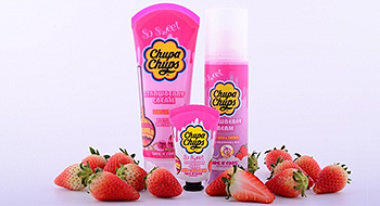
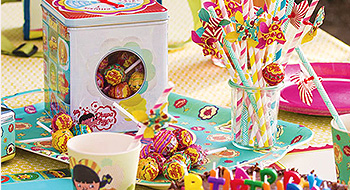
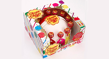
Company Profile -

Business Description -

Exhibitions -

Location
|
Sweet Beginning
|
International exhibition for licensing and brand extension
24/09/2024 - 26/09/2024
Location ExCeL London
London
Great Britain